Custom vinyl banners can do so much more than display information. When designed correctly, they can convey a message that leaves a lasting impression. With this kind of power, the right font style and color are critical, whether designing a business promotion or creating something for a personal celebration. A few simple but effective choices can help ensure your banner stands out from the rest.
Discover why fonts and colors are crucial in vinyl banner design and which are the best choices.
Effective fonts and colors for vinyl banners
Font significantly impacts how the message on a custom vinyl banner is perceived. It conveys tone — are you going for formal or playful? Modern or classic? Font can also directly impact how quickly the reader processes what the sign says. For instance, bold, minimalistic fonts are easy to read and ideal for high-traffic areas where you only have a limited time to capture your audience. On the other hand, script fonts are more personal but can be more challenging to read.
Color psychology is another aspect to consider when it comes to banner effectiveness. Certain hues evoke specific emotions and influence how a message is received. Red and orange create urgency and excitement. Blue and green are calming and trustworthy. Earthy, muted tones communicate sophistication and reliability. Aside from mood, the colors you choose should also be visually appealing and stay true to your brand.
Trending custom vinyl banner fonts
Similar to fashion, home decor, and beauty, there are trends in font design. If you’re creating a custom vinyl banner in 2025, here are some of the most popular font choices:
1. Modern Gothic. This elegant yet bold font choice elicits a sense of sophistication. It’s a font for high-end brands and corporate banners, ideal for trade shows, networking events, and luxury product launches.
2. Bold Minimalistic. Simple, thick fonts with clean edges are easy to read and have a modern appeal. These fonts work best for outdoor banners and grand openings.
3. Pixelated. Are you a fan of retro, tech-inspired aesthetics and nostalgia? Then, you’ll love a pixelated font. These kinds of fonts are perfect for gaming events and digital product launches.
4. Handwritten or Script. Soft and personal fonts are great for boutique businesses, wedding signage, and artistic brands. Use them sparingly, though, because they can be hard to read.
Popular font colors for custom vinyl banners
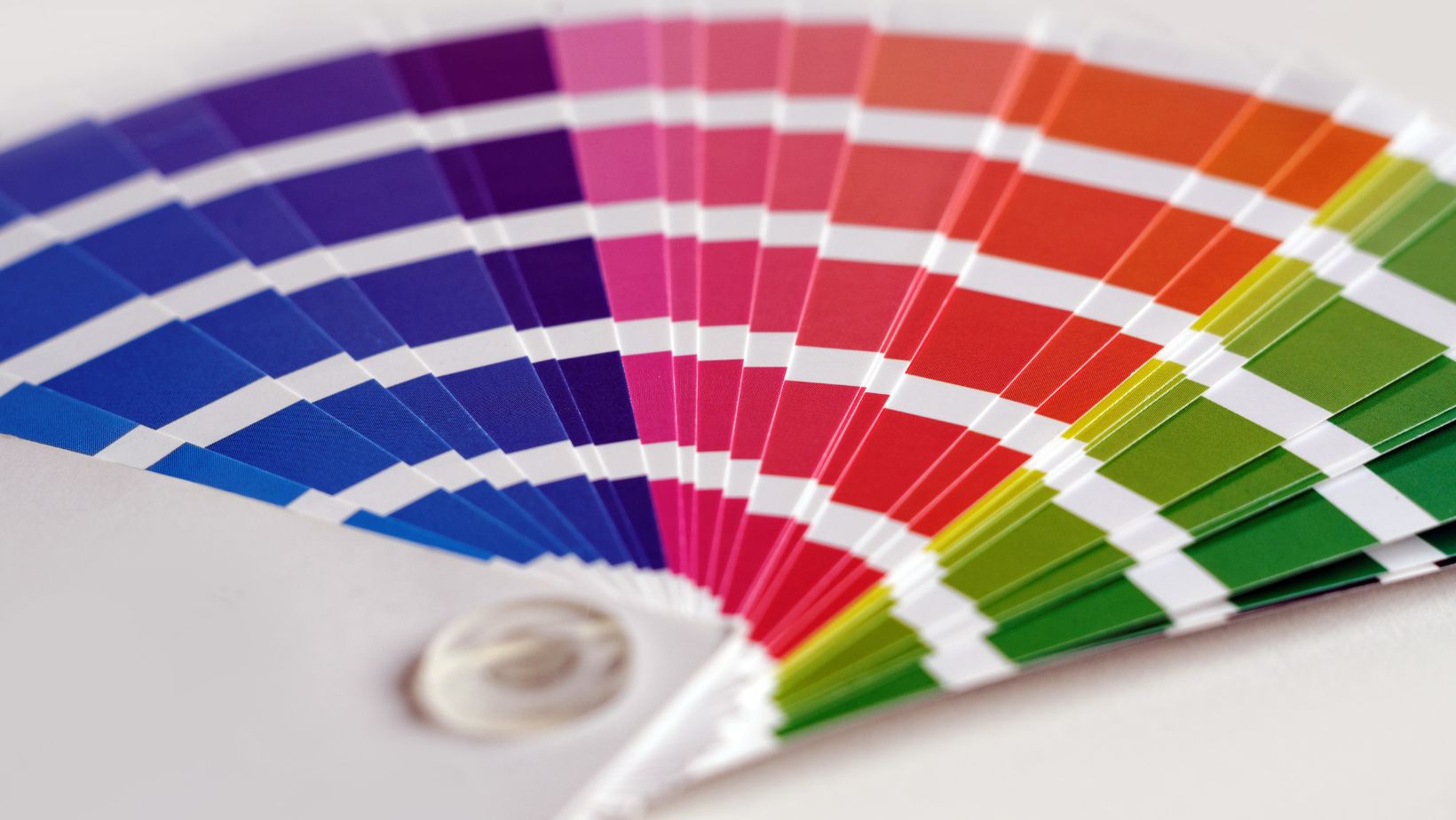
Once you decide on a font, start thinking about the colors on your banner. Here are some of the most popular colors for signage in 2025:
1. Bright and bold gradients. Think neon pink fading into citrus yellow. These dynamic color blends create a vibrant, high-energy look that is perfect for promotional events, festivals, and modern brand activations.
2. Mocha Mousse. The 2025 Pantone Color of the Year is a warm, earthy brown that brings a natural, sophisticated touch to banners. It’s an excellent choice for eco-friendly brands, luxury events, and neutral-themed marketing materials.
3. Cinnamon Slate. Give off a relaxed, elegant vibe with Benjamin Moore’s Color of the Year. This muted purple and brown tone looks fantastic paired with gold or cream. It creates a timeless, upscale look for business banners, real estate marketing, and upscale events.
4. Sherwin-Williams Dopamine Colors. Inspired by bright, mood-boosting shades, this palette features energetic yellows, greens, and blues designed to uplift and inspire. It’s great for wellness campaigns and educational events.
Practical tips for designing vinyl banners
When creating vinyl banners, effective design is key to capturing attention and conveying your message clearly. Here are some practical tips to help you throughout the design process:
- Use complementary colors (opposites on the color wheel) for a bold, eye-catching design.
- Play with contras, like dark text on light backgrounds and vice versa.
- For professional banners, stick to monochromatic palettes for a sleek look.
- When using bright colors, pair them with neutral backgrounds to maintain readability.
- Choose fonts and colors that match your brand personality.
- Test fonts and color combos before printing a banner — use Canva or Adobe Color to get a better idea!
- Keep text size large enough to be readable from at least 10-15 feet away.
- Avoid overcrowding with too much text or unnecessary graphics.
- Think about where you’re hanging it, as lighting conditions (indoor vs. outdoor) impact color visibility.
Experiment with these trends while staying true to your brand’s identity, and you’ll have a banner that stands out in any setting!

